Trojan Rebrand
A hypothetical rebrand for Trojan Brand, a company selling condoms and other sexual health products, that modernizes the visual language of the brand. It emphasizes the product diversity while energizing the brand assets to appeal to a young demographic.
🍞 Role
Brand Designer
🏹 Skills
Branding, Motion Design, Advertising Design, Packaging Design, Copywriting
🌱 Year
2020
Brand Designer
🏹 Skills
Branding, Motion Design, Advertising Design, Packaging Design, Copywriting
🌱 Year
2020
The existent Trojan brand is functional, but not appealing, and its marketing is disconnected across platforms. As the leading condom manufacturer in the United States, Trojan sales are pushed by the historical weight of the brand.
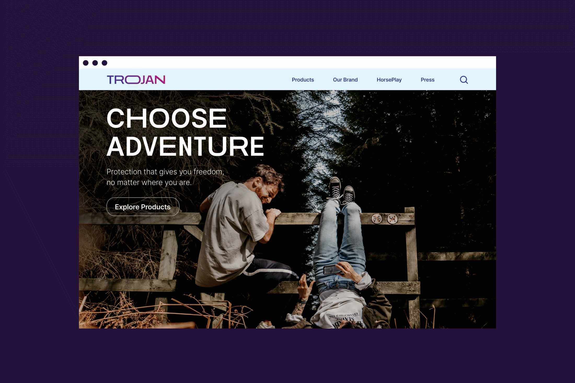
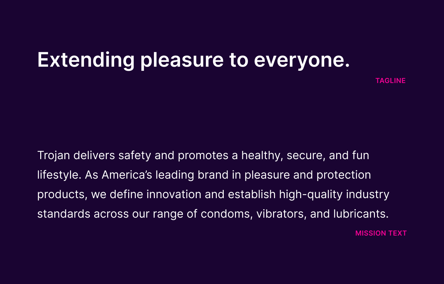
Its visual assets are disconnected from the marketing tactics; this rebrand makes the company cheeky, bold, and emphatic in its products with one main goal: Extending pleasure to everyone.
Its visual assets are disconnected from the marketing tactics; this rebrand makes the company cheeky, bold, and emphatic in its products with one main goal: Extending pleasure to everyone.


✌️ Behind the Scenes
The Existing Brand
The Trojan brand is fragmented. After analyzing brand positioning for Trojan and its main competitors (Durex, LELO, and Skyn), I saw that Trojan lacks a connection with its target audience. To address this issue, I decided to create a more modern brand and emphasize the breadth of products and choice at Trojan.
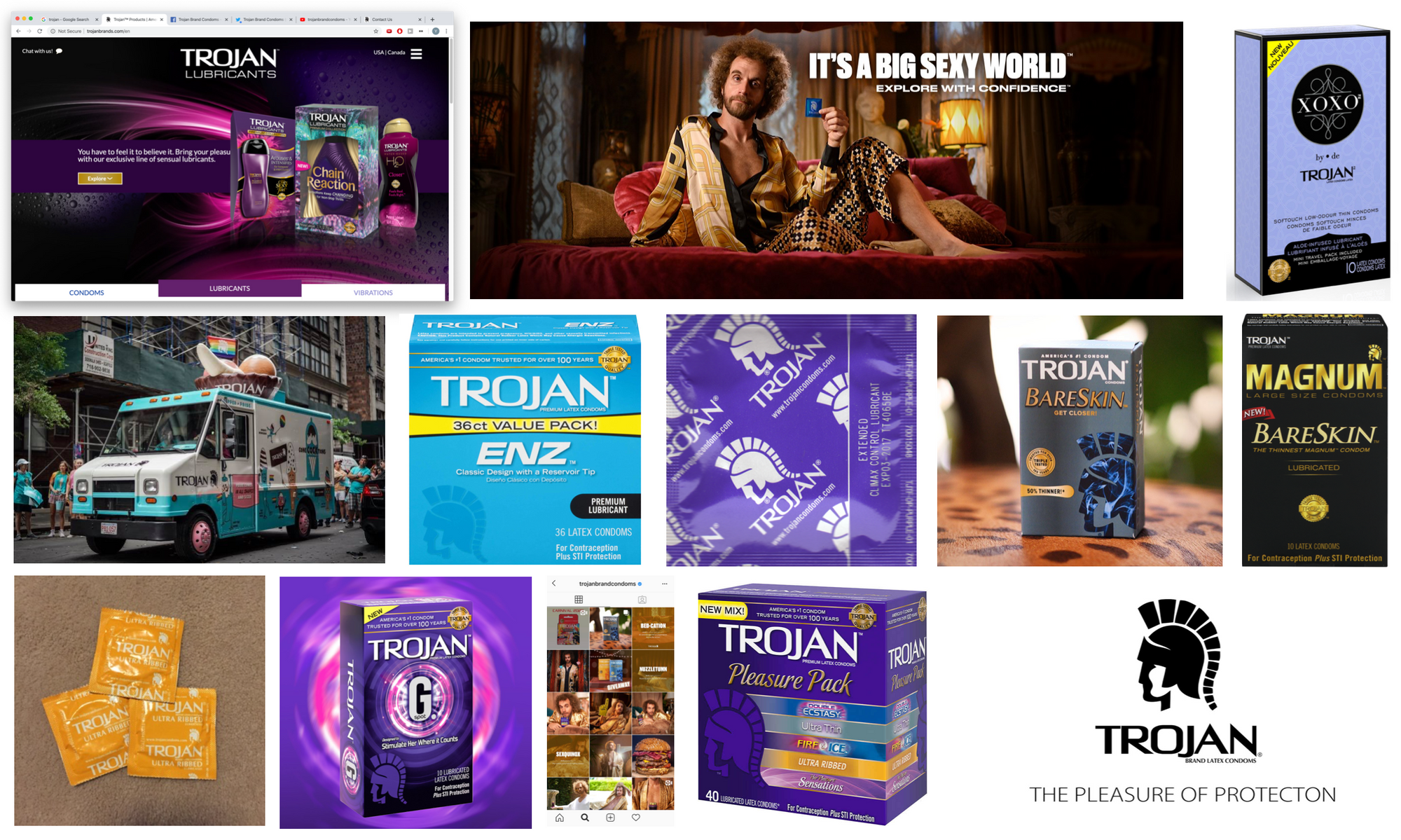
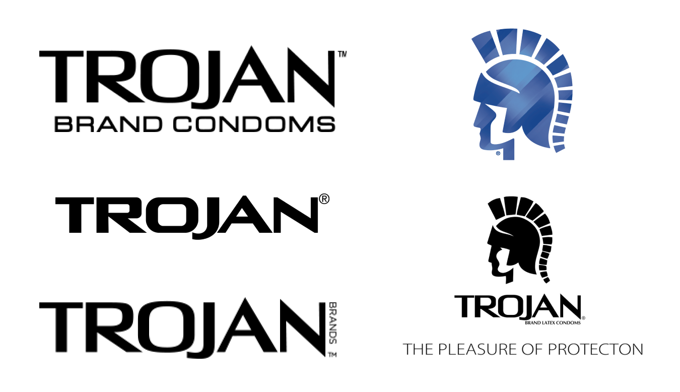
Above: Existing assets for the Trojan brand.
The Trojan brand is fragmented. After analyzing brand positioning for Trojan and its main competitors (Durex, LELO, and Skyn), I saw that Trojan lacks a connection with its target audience. To address this issue, I decided to create a more modern brand and emphasize the breadth of products and choice at Trojan.
Above: Existing assets for the Trojan brand.
Brand Language
While this project is a visual-focus rebrand, I set aside some time to update the driving mission statement and tagline to prioritize the company’s important aspects.
While this project is a visual-focus rebrand, I set aside some time to update the driving mission statement and tagline to prioritize the company’s important aspects.
It’s Logo Time!
The previous logos had a lot of variety, depending on the use.
Pictured left: existing logo versions.
The previous logos had a lot of variety, depending on the use.
Pictured left: existing logo versions.
While I started with more pictoral illustrations, I quickly realized that these icons were more representative of “Troy” as a historical city than “Trojan” the condom company.
As I iterated, I felt that using a logotype instead of a symbolic approach would offer me more opportunity to be subtly tongue-in-cheek, compared to overt representation.

I was particularly drawn to using the “O” of “Trojan” to hint at extensions or expansion, so I pursued digital iterations.
With the first logo in the upper left, I saw opportunity to bring motion to the logo. Using diagonals as a brand motif would also reflect well on the company vision for a more exciting, dynamic visual identity.
With the first logo in the upper left, I saw opportunity to bring motion to the logo. Using diagonals as a brand motif would also reflect well on the company vision for a more exciting, dynamic visual identity.
I made a quick motion sketch, but realized that the diagonal expansion created odd pockets of white space, and the logo would be especially difficult to work at a smaller scale. Additionally, I received feedback that this logo might be too obviously phallic, especially if it were to be used in print or advertising that would be widely seen. My professor, Ben Franklin, suggested that I continue along the lines of “expansion” in text with a more subtle approach. So, I pursued the direction of the last logo, focusing on horizontal shifts.
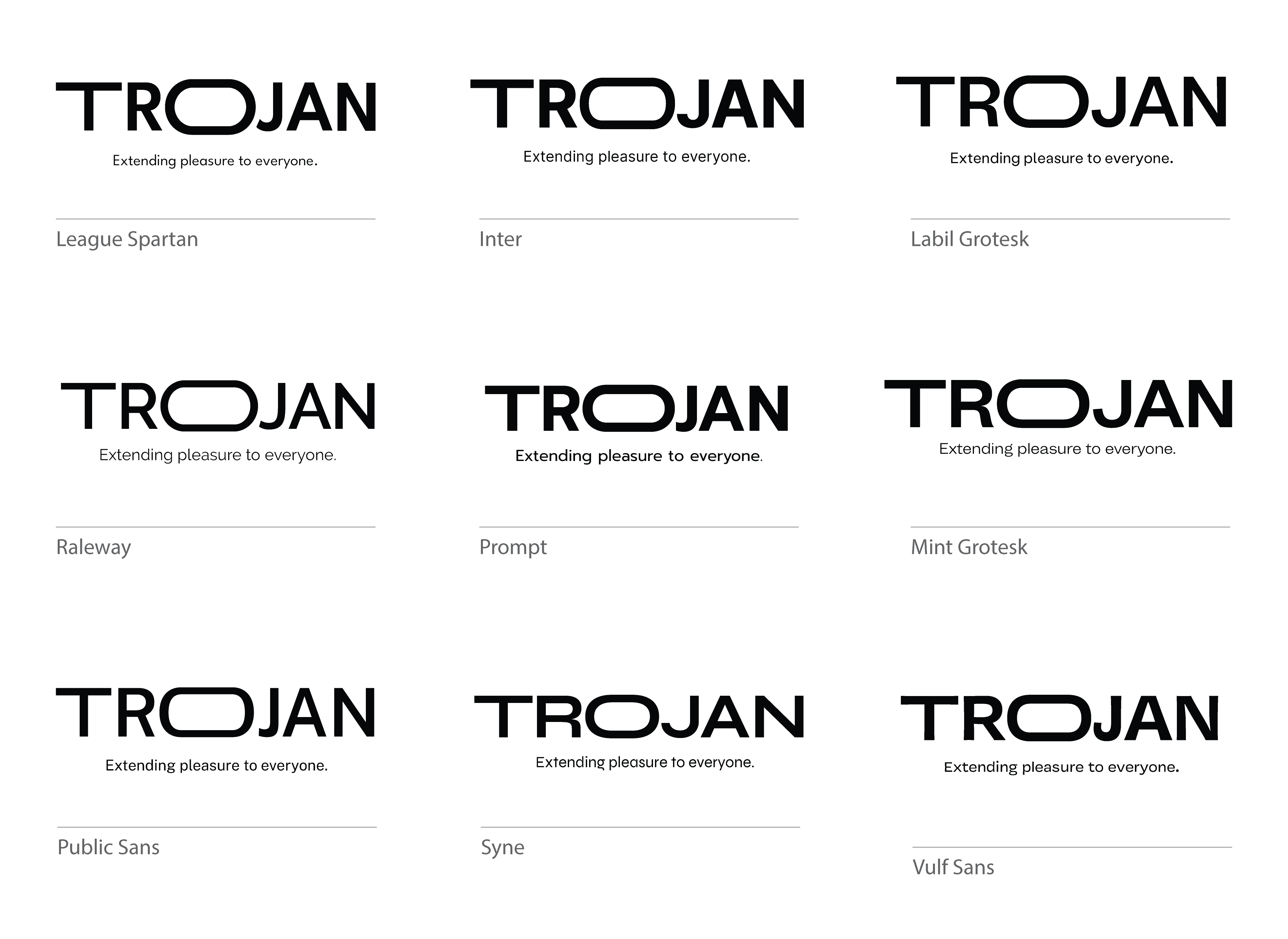
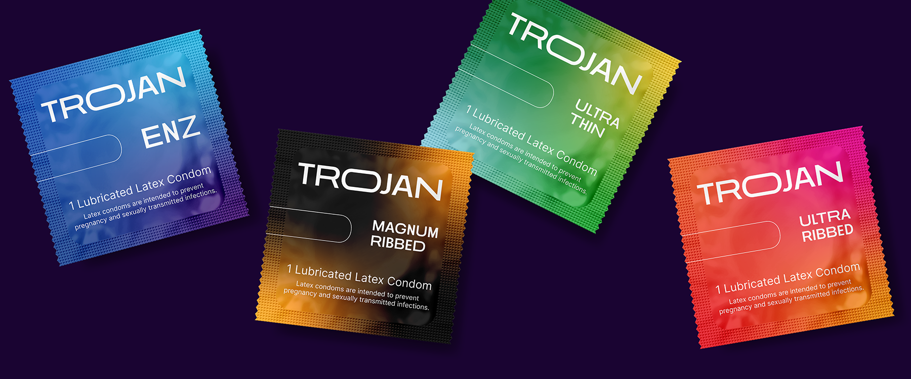
For the brand typography, I wanted a typeface that would work at both large and small scales. Eventually, I landed on Inter (first row, center) for its solid bold weight for the wordmark, as well as clear legibility at the smaller scale. Some kerning there, some expansion of glyphs there... and the final logo was completed!
Final logomark lockup.
Brand Visuals
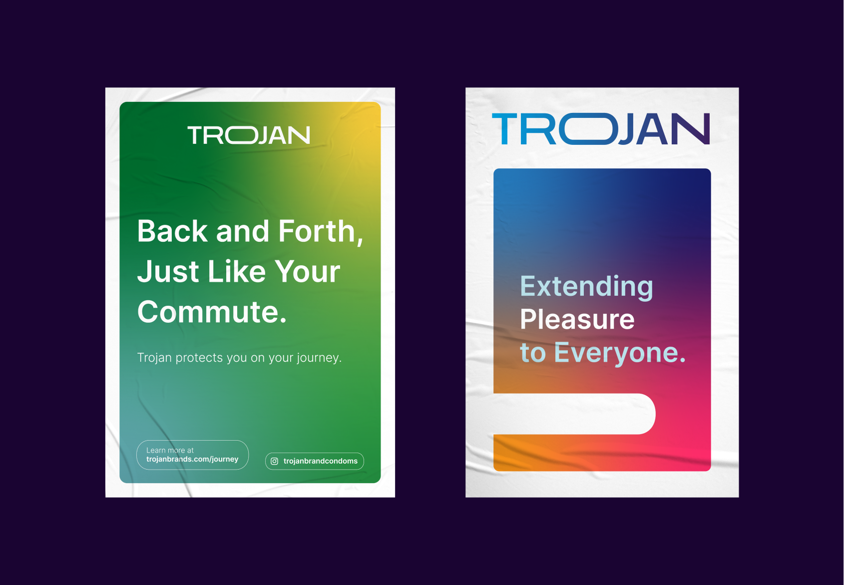
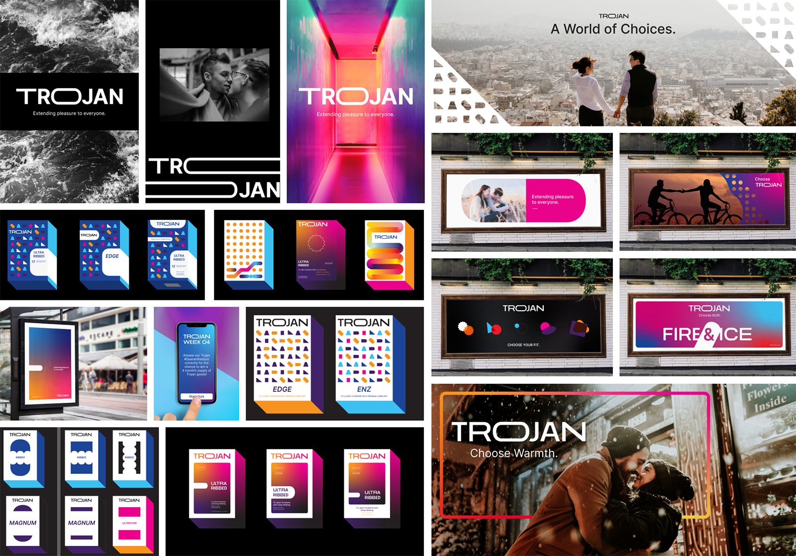
This board is an abridged sample of the directions I looked at for the brand visuals. I ultimately landed on the use of a gradient and an oblong motif.
This board is an abridged sample of the directions I looked at for the brand visuals. I ultimately landed on the use of a gradient and an oblong motif.