Color Experiments - 200220
![]()
I GOT IT! Who knew choosing colors could be this excruciating... While I’m personally drawn to warm colors, all the pairings I created seemed very derivative of common color trends in illustrating with grain texture. (We’ve all seen it on Dribbble, the fuschia/navy/pink/cyan color palette.) I wanted the color palette to be able to evoke a sense of calm and wisdom (concentration) in some cases but also notes of tension and chaos (tech alerts).
I was at the point of spiraling into a Dribbble black hole when my friend Kuu Chen (also fantastic! Check out their work!) suggested that I look at some artbooks for color schemes.
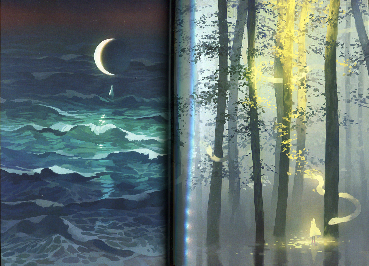
I picked up Only Island, an illustration book by Loika from their desk and ended up flipping to this spread. I fell in love with the calming peace that comes through with the green, especially in the dark forest forms.
![]() Scan of the spread I was looking at.
Scan of the spread I was looking at.
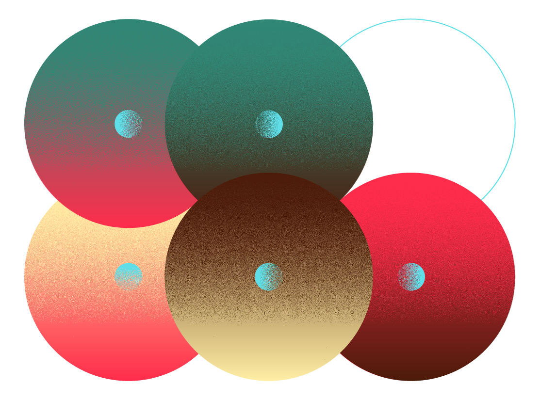
I wanted to see if I could make a palette combining a darker green (for calm/serenity/wisdom) and a fuschia (for energy/vividness). The cream and brown tones balance out the palette and provide a light and dark value to work with. The cyan is used as an accent color.
![]() Final color palette.
Final color palette.
![]()
![]()
![]()
![]()
![]()
![]()
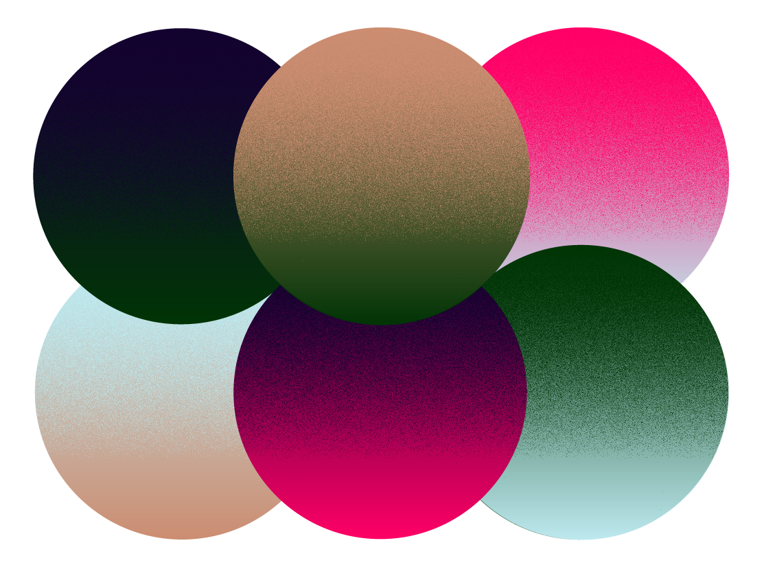
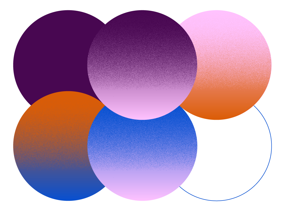
Palettes that didn’t make the cut.
Question for today: How do I apply the color scheme to the project? Limited palettes? Full-on explosions?
I GOT IT! Who knew choosing colors could be this excruciating... While I’m personally drawn to warm colors, all the pairings I created seemed very derivative of common color trends in illustrating with grain texture. (We’ve all seen it on Dribbble, the fuschia/navy/pink/cyan color palette.) I wanted the color palette to be able to evoke a sense of calm and wisdom (concentration) in some cases but also notes of tension and chaos (tech alerts).
I was at the point of spiraling into a Dribbble black hole when my friend Kuu Chen (also fantastic! Check out their work!) suggested that I look at some artbooks for color schemes.
I picked up Only Island, an illustration book by Loika from their desk and ended up flipping to this spread. I fell in love with the calming peace that comes through with the green, especially in the dark forest forms.
 Scan of the spread I was looking at.
I wanted to see if I could make a palette combining a darker green (for calm/serenity/wisdom) and a fuschia (for energy/vividness). The cream and brown tones balance out the palette and provide a light and dark value to work with. The cyan is used as an accent color.
 Final color palette.
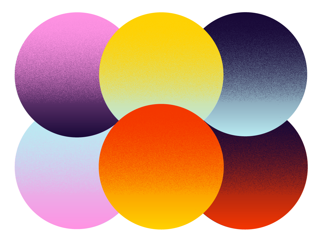


Palettes that didn’t make the cut.
Question for today: How do I apply the color scheme to the project? Limited palettes? Full-on explosions?