All Human
October 2019
Identity Design, Branding, Motion Graphics.
A hypothetical branding identity for the exhibit Ai Weiwei: Bare Life at the Mildred Lane Kemper Art Museum. Created alongside four teammates.
*All visuals created by me unless noted otherwise.
*All visuals created by me unless noted otherwise.
![]()
Bus Stop Ad

Bus Stop Ad
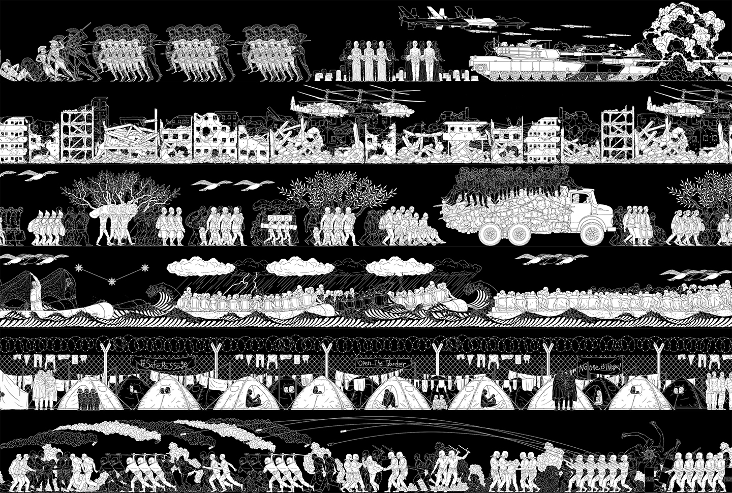
Ai Weiwei: Bare Life is a show at the Kemper Art Museum of Washington University in St. Louis. The exhibit’s brand identity is inspired by the Chinese character rén (人) meaning human, as many of the works focus on humanity and the idea of a human collective, often struggling against the powers of a few individuals.
Branded Materials

Animated Logomark

Exhibit Website Mockup

 Additional branded materials by Emma Gindy & Lily Greenwald

Promotional coasters in an infinity book format, created by Michelle Kim
Process
︎︎︎The Exhibit
The show is split into two sections: Bare Life focuses on uplifting the voices of people who have been oppressed, while Rupture references the writings of German-Jewish philosopher Hannah Arendt on breaking from tradition.
The show is split into two sections: Bare Life focuses on uplifting the voices of people who have been oppressed, while Rupture references the writings of German-Jewish philosopher Hannah Arendt on breaking from tradition.
Ai Weiwei, Odyssey, 2016.
Wallpaper.
 Ai Weiwei, Through, 2007–8.
Wooden tables and beams and pillars from dismantled temples from the Qing Dynasty (1644–1911)
Visiting the exhibit, I was particularly struck by two pieces: Odyssey and Through. Odyssey completely covers two walls of the room, but upon closer examination, there is a myriad of details as well. I started to think about scale; not just physically, but with multiplicity: an individual vs. the collective.
For Through, the exhibit catalogue and a guided tour both emphasized that this piece was created with traditional Chinese jointry methods: no glue or screws were used to join these wooden beams. From this piece, our group pulled the idea of connection and interconnectivity. While the emphasis on joints and connections is physical for the piece Through, the idea manifests in the Bare Life section as a more conceptual approach focused on humans.
For Through, the exhibit catalogue and a guided tour both emphasized that this piece was created with traditional Chinese jointry methods: no glue or screws were used to join these wooden beams. From this piece, our group pulled the idea of connection and interconnectivity. While the emphasis on joints and connections is physical for the piece Through, the idea manifests in the Bare Life section as a more conceptual approach focused on humans.
Inspiration
As a team, we all pitched ideas for the brand identity. In the end, we landed on one of my proposals: using the Chinese rén (人) character, meaning “person” or “human”, as a way to frame the exhibit.
![]()
As a team, we all pitched ideas for the brand identity. In the end, we landed on one of my proposals: using the Chinese rén (人) character, meaning “person” or “human”, as a way to frame the exhibit.

Early experiments with the mark
Refinement
We worked to refine the mark into a shape with more meaning than just rén (人), or a “sparkle-like” diamond. Inspired by the inktrap notches on a typeface that she found, Emma proposed adding in notches to the mark to suggest links and connection similar to Ai Wei Wei’s piece Through. From this base, we decided to separate the top and bottom marks to demonstrate the idea of a collective made of individuals.
We worked to refine the mark into a shape with more meaning than just rén (人), or a “sparkle-like” diamond. Inspired by the inktrap notches on a typeface that she found, Emma proposed adding in notches to the mark to suggest links and connection similar to Ai Wei Wei’s piece Through. From this base, we decided to separate the top and bottom marks to demonstrate the idea of a collective made of individuals.
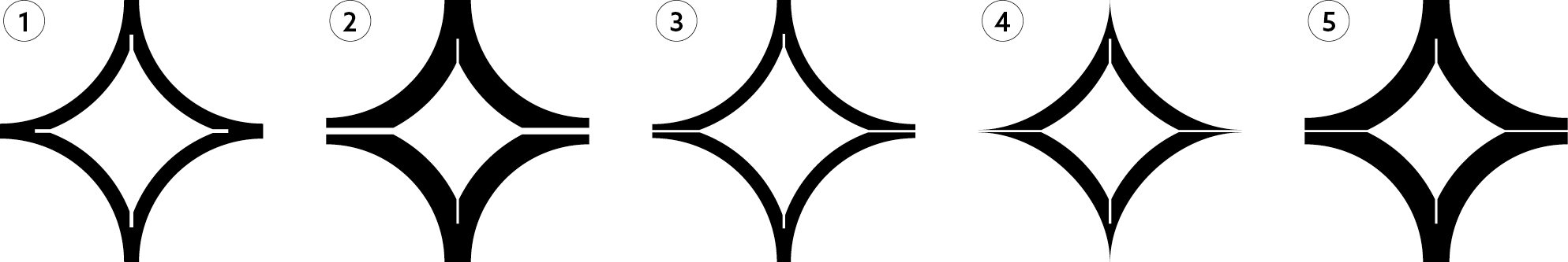
Mark 1 designed by Emma, refinement by me in marks 2-5.
Motion
The first iteration focused on “reveal”, showing the exhibit name first and then the logomark. Given the timing, however, the mark is less impactful when tacked on at the end. In the final iteration, I revealed the mark first, and also made the type mimic the motion of the symbols by coming closer together to show a collective.

First draft
Final Version
Final Thoughts
We presented to critique guests who worked in local museums, and they enjoyed the conceptual basis for our branding and logomark. The biggest area of change they suggested was a greater inclusion of the Kemper Museum’s branding, since this exhibit is hosted at the Kemper.
For my contributions, I enjoyed having the motion conceptually mirror our branding; for example, in the bus stop ad, I had the symbols slowly appear in a rising motion to hint at a multitudes of individuals collecting together.